collage

Markmaking influences / how I got here

The pieces in my upcoming “Gesture and Flow” exhibition (May/June 2023) make my interest in line and type more apparent than in any body of work I’ve produced before. The backstory that got me here seems worthy of exploring.

As a graphic design student at Oregon State University, an incredibly thorough understanding of typography was demanded. This was pre-computer so we were drawing letterforms and roughing in text blocks by hand for our projects. The curriculum also included a full year of calligraphy courses (thank you, Allen Wong). By senior year we were able to access and incorporate rub-on (Letraset) type. We also learned how to mark up text and specify typesetting so it could be ordered from actual typographers.

As a senior, I had an internship in the campus Office of Publications under the amazing mentorship of Marilyn Holsinger (both an ace designer and a talented calligrapher).

Shown here is the outside spread from one of my first projects under Marilyn’s influence. It incorporates wave forms that I designed, then carefully inked by hand onto mylar.

Brochure spread measures 11 x 11”, folds to 5.5” x 11”, circa 1978 (!)

Although most of the University’s materials were photo-typeset, the class catalog (about the size of a phonebook) was still being set with hot metal on Linotype machines which made a distinctive and impressive racket. It was amazing to witness the whirlwind of change that eventually ushered in digital typesetting. The campus print shop had a full range of printing equipment too.

I consider it a gift to have seen all of the processes and machinery in action. I learned so much about the evolution of typesetting and printing practices from a hands-on perspective. (During the internship Marilyn also used me as an occasional model for campus promotional materials — that’s me back in the day.)

This background always informed my design work and 40+ year career. I occasionally developed gestural calligraphic and strongly-lined woodblock illustrations to use in client projects. And all the while, I was also pursuing my interest in collage, at first in a limited way, but by the late 1990’s I was very focused on collage as a complement (and antidote) to my computer-based design work.

Hand-carved woodblock print made to illustrate a client brochure, approximately 10 x 8”, circa 2003.

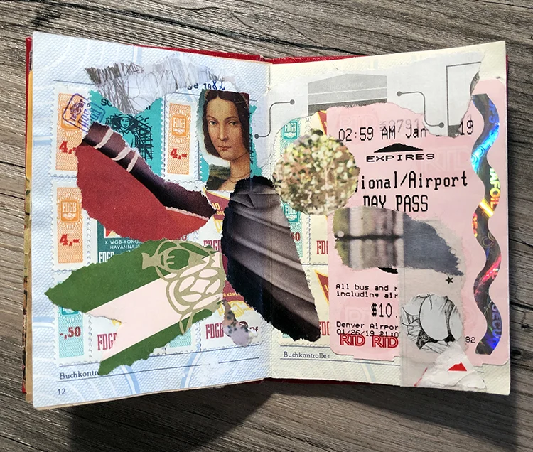
When the Covid lock-downs began in 2020, while on extra-long Zoom calls, I began altering magazine photos with marks, patterns, and asemic writing. I have used fragments from some of those images in a few collages, like these, made in response to a call for art sponsored by the Doug + Laurie Kanyer Art Collection. I still have a big folder of patterned elements that may come into play in future collages.

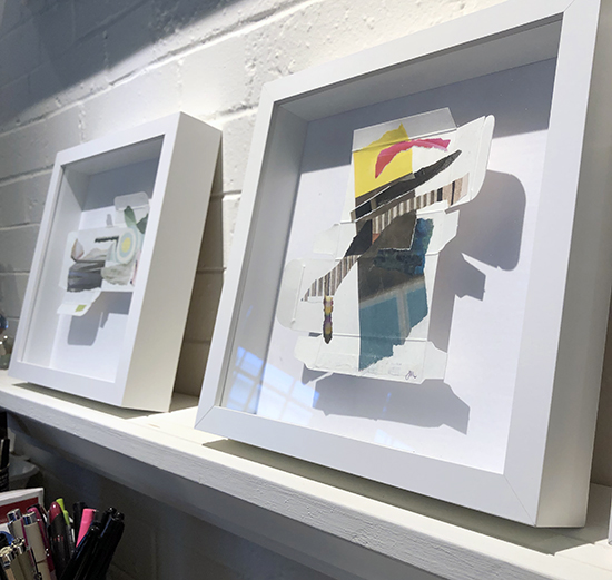
Small collages, each just 1” square, using some elements that were altered with white ink, 2020

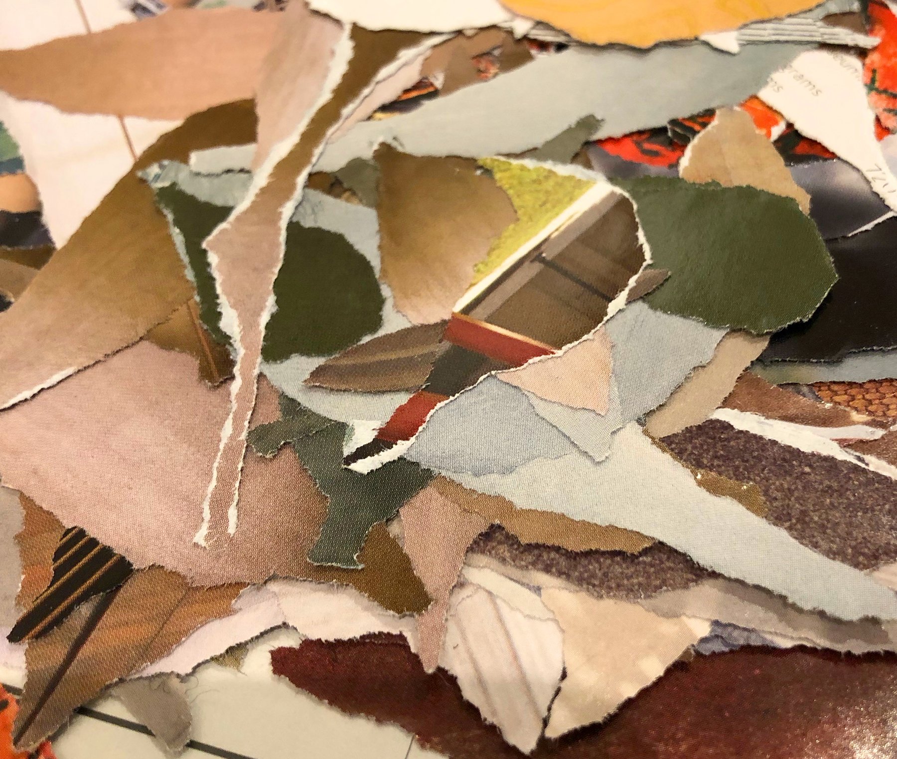
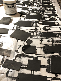
A small pile of my inked-upon collage elements. I usually make the marks while the imagery is still in the magazine, and them rip pieces out to get the shapes/bits I want for a project.

As you might imagine, there is more to the story of incorporating markmaking with collage — so this is the first of one (or a few?) more post/s to come.

The no-scissor zone

You’ve probably noticed that the papers used in my collages are torn, instead of cut out. Any straight lines in my work are the included edge of a piece of paper or a graphic element within the image I've selected. Because I work most often with non-identifiable, somewhat nebulous, imagery (color, textures, blurred backgrounds), cropping those elements to produce a rough edge usually seems more appropriate to me.

Tearing has become a creative gesture akin to drawing. The process creates the lines that define areas in the collages. Over time I’ve even taught myself how to rip pretty decent circles out of paper — and it’s actually become a kind of meditative moment.

An example of directional tearing.

My work process is not as random as it might seem at first glance. Every aspect is intentional. I try to use the torn edges to my advantage. If you rip a magazine photo, you typically end up with a white edge on one side of the tear. On the other side, the ink usually extends to the paper's edge. I often use “directional tearing” to create a white edge as a highlight or a bridge to another element. If I want the edges to blend in to a compositions, I will make the tear in the other direction.

I love the feathery character of the paper fibers that are exposed when tearing. The torn edges help to meld and blend adjacent paper fragments together. I have the impression that those little fiber fingers around the edges help keep papers adhered better (maybe?)!

I love the portability of collage! This one includes some torn circles and other elements culled from a magazine while in flight.

Tearing allows me to crop the paper elements that I want to use in the same way that scissors would, but the result has a softer, more organic feel. I also can gather materials while traveling, and in almost any situation, with ease — and no worries about what scissors are acceptable to carry through security to board an airplane. (I have to admit that I miss the pre-pandemic airline magazines from which I would harvest ingredients for collage projects, while my bemused fellow passengers looked on!)

I adore oh-so-many collage works that incorporate cut elements, yet somehow the ripped edges resonate most with me for my own work.

Caveat: In occasional situations (such as my ThroughLines series), I rip papers against the edge of a ruler as a compromise to achieve a roughly straight edge. I’ve cut a few images in the case of a specific commission where it was appropriate. And somewhere out in the ether are a few early collages with straight edges — made before I discovered the aptness of a rip/tear approach!

Art project, on the wing

I rarely participate in traveling/mail art projects however, every once in a while, I jump in.

While traveling in February, I had a chance to visit with artist Bonnie Ruttan who had received a passport-sized book to create artwork in and then pass along. It was so compact and interesting. It had originated in Austria, then traveled to Ireland, and now was being passed around in the US. Eventually it will (hopefully) make its way back to Kevin Geronimo Brandtner who started the project.

Inside cover of the mail art project book.

Inside cover of the mail art project book.

Intrigued, I decided to participate. The pages were small and had some stamps already in place as a background. Most artists were giving a nod to the passport/travel theme in their collaged responses. One of the fun things about the package was that it included a small packet of business cards and paper ephemera from artists who had participated before me, along with earlier mailing envelopes with scars and stamps.

The starting spread…

The starting spread…

Here’s an image of what I started with and another of what my page spread looked like when completed.

My finished contribution to the project.

My finished contribution to the project.

I included a ticket from Denver’s light rail A-Train to the airport that features a squiggle of reflective holographic security foil, plus other imagery that related to the colors and design already on the page. A nice departure from my usual work in the studio and the book is now off to its next stop in New Mexico.

Fun!